Toolbox
The Toolbox menu toggles the component panel used for adding form and flow elements in the Synergy IDE.
When first opened, the Toolbox panel is empty unless a form or flow file is active.
It dynamically loads categorized components for the currently opened editor.
- Form files display UI-related components
- Flow files display logic/control components
- Code files do not activate the Toolbox
Toolbox
The Toolbox is a context-sensitive drag-and-drop panel that provides categorized components for form and flow design.
The Toolbox is a utility panel in Synergy IDE used to build forms and workflows by dragging components onto the design surface. The content of the Toolbox dynamically changes based on the active file (form, flow, or none).
Behavior by Context
No File Opened
If a project is open but no form or flow file is active, the Toolbox remains empty or inactive, as there is no design context to interact with.
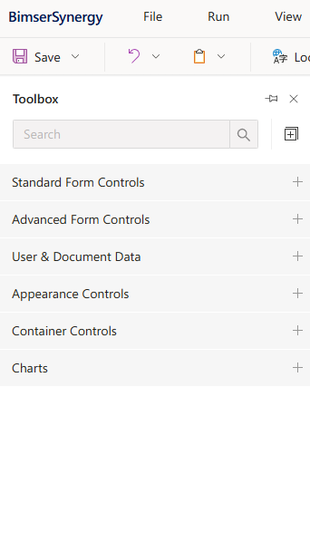
Form View Active
When a form file is opened, the Toolbox shows components suitable for UI design:
Standard Form Controls
(TextBox, Label, ComboBox, Checkbox, etc.)
Advanced Form Controls
(MultiSelect, MaskInput, FileUpload)
User & Document Data
(UserSelector, DocumentSelector, DynamicField)
Appearance Controls
(Image, Icon, TextBlock, Separator)
Container Controls
(TabPanel, GroupBox, Accordion, Repeater)
Charts
(BarChart, LineChart, Gauge)
Each control can be dragged onto the canvas and configured using the Property Inspector.
Flow View Active
When a flow file is opened, Toolbox presents flow-related categories:
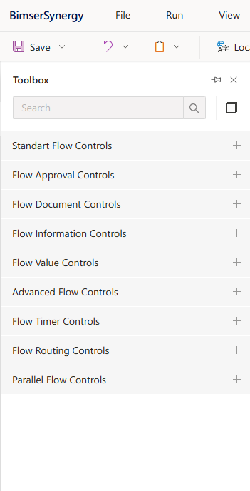
Standard Flow Controls
(Start, End, Decision)
Flow Approval Controls
Flow Document Controls
Flow Information Controls
Flow Value Controls
Advanced Flow Controls
Flow Timer Controls
Flow Routing Controls
Parallel Flow Controls
Flow items are connected using drag-and-drop lines to build the logic.
Code File (TS, CS, CSS)
If only a code file like .ts, .cs, or .css is open, Toolbox will be hidden or inactive. No components are shown in code view.
Features
Context-aware: Shows only relevant controls for forms or flows
Categorized UI: Easier navigation via grouped sections
Drag-and-Drop Support: Quickly design UI or flow logic
Searchable Panel: Quickly locate the desired component
Extensible: Custom components can be added
Notes
Toolbox contents auto-update depending on the selected file. Drag-and-drop is available only in visual design editors (form or flow). Some controls may be disabled based on project configuration or permissions.
#linkDocument (DeveloperGuides.IDE.TopMenu.View.Toolbox) #linkDocument (DeveloperGuides.IDE.Toolbox.FAQs) #linkDocument (DeveloperGuides.IDE.Toolbox.HowTos)
See Also
FAQs
How To's
- How To Add And Configure Charts In A Form
- How to Add UserMetadata or DocumentMetadata to the Form
- How Does The Toolbox Behave In Different IDE Contexts
- How Does The Toolbox Behave In Different IDE Contexts
- How To Add And Configure Charts In A Form
- How To Add A Component To A Form Using The Toolbox
- How to Use FileSelector or RelatedDocuments Components
- How to Add UserMetadata or DocumentMetadata to the Form